Welcome to Arcadia!
As we relaunch Quercus’ Science Fiction and Fantasy imprint (formerly Jo Fletcher Books!) we wanted to take a little time to talk about why we chose the name Arcadia, and why our new logo is a fox.
We spent months bouncing potential new names back and forth: we wanted a name that suggested the speculative or the fantastical, but had a broader scope than just the name of a constellation or a mythical animal. This was no easy task; as you might imagine, any compelling name out there has probably been claimed by a small press at some point in the past!
CS Lewis’ description of the Pevensie children feeling the brush of the fur coats in the wardrobe become the bristly needles of pine trees as they passed through to Narnia has always fired my imagination. So I started thinking about forests – the greenwood of the Robin Hood stories, Holdstock’s Mythago Wood, Mirkwood, the Hundred Acre Wood. Perhaps, I thought to myself, there’s something here.
My thoughts led me to arcadia – the Edenic paradise of myth, the realm of Spenser’s fairy queen, the national park in Northeastern Maine. (Yes, that’s actually called Acadia, but it’s a corruption of Arcadia, and so-named for its otherworldly nature.)
There was no way the name Arcadia hadn’t already been snapped up by a publisher; it was too good.
But luck was on my side. Arcadia has been taken as the name of a small press – Arcadia Books, founded in 1996 as a fiercely independent publisher of high-quality fiction and non-fiction, and one of the early champions of diversity and representation in British publishing, long before that became a preoccupation of mainstream commercial publishing in the UK.
And: Quercus had bought Arcadia in 2021.
I proposed the idea of repurposing this name to our board, and the board came back with unanimous support.
So Jo Fletcher Books, long a bastion of superb, high quality SFF publishing, joined forces with Arcadia, a bold and fearless voice of independence.
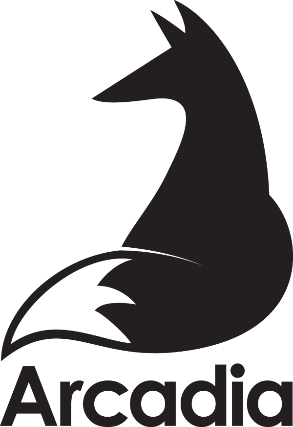
But why the fox?
Once we’d decided on a name, we had to find the right image to decorate the spines and copyright pages of our books, adorn our tote bags, and fit in with the other Hachette SFF imprints – all while suggesting the otherworldliness of Arcadia as an idea, and Jo Fletcher Books and Arcadia the small press.
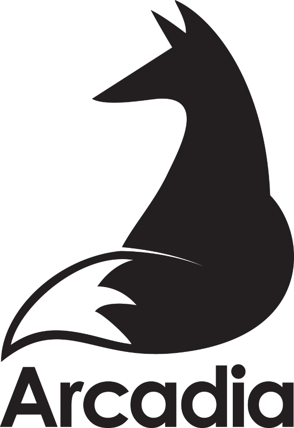
I’ve briefed two colophon designs previously – the old-school t. rex of Jurassic London, the small press my husband and I founded a dog’s age ago, and Pickwick the dodo, Hodderscape’s logo. In both cases, I knew what I wanted and what I wanted it to look like; this time, I had less direction, but an open mind. I spent a weekend flipping through my collection of books about design, publishing history, manufacturing history, and mythology – after all, inspiration can come from unexpected places. And that’s where I found it: a delightful mid-century logo from a Soviet manufacturing plant in the shape of a sprightly little fox. A fox! How perfect! Love them or hate them, foxes are extraordinary animals: beautiful, fearless, and almost ethereal in their weirdness. Agile, bold, exciting and distinguished: once we’d started thinking about it, we knew the fox was our perfect mascot and colophon.
Our lovely cosy fellow (as yet unnamed!) was designed by Andrew Smith, who also does many of our gorgeous covers and also designed the Quercus colophon, the parentheses with a little tail. The typeface for Arcadia is a little nod to the mid-century fox logo that inspired us in the first place.
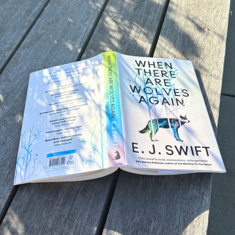
The first book that will be publishing with the new colophon is James Logan’s The Silverblood Promise – keep an eye peeled for the fox, coming soon to bookshelves everywhere.
And welcome to Arcadia!
P.S. Don’t forget to sign-up to our newsletter for regular updates, exclusive content and tips and tricks for writers